
How to compete against lower-priced alternatives
The standard advice is to differentiate on quality and tell your story. A Japanese concept called sonzaikan offers a sharper framework.

Created with AI, human-directed at DLKR.
The anxiety
Your product costs $80. The alternative costs $30. They're sitting on the same screen, three scroll-lengths apart, and the customer is comparing them right now.
You know your product is better. You know the materials are different, the construction is different, the thought behind it is different. But the customer doesn't know that yet. They see two options, one costs nearly three times the other, and the $30 version has 4.5 stars from 2,000 reviews.
This is the moment that keeps DTC founders up at night. Not because they doubt their product. Because they don't know how to make the difference visible before the comparison is decided.
The question comes up constantly: how do I compete against cheaper alternatives?
It's the wrong question. But the anxiety behind it is real, and the standard answers don't help.
What most strategists tell you
Ask a brand strategist how to compete against lower-priced alternatives and you'll hear some version of these four things:
Differentiate on quality. Make a better product and the right customers will pay for it.
Tell your story. If customers understand the craft, the materials, the process behind your product, they'll see the value.
Build your brand. Invest in identity, in voice, in customer experience. People pay more for brands they trust.
Target the premium customer. Stop trying to win the price-sensitive buyer. Find the people who don't care about price.
This advice isn't wrong. Each piece contains a real insight. But taken together, it fails in the exact moment the founder needs it most: the comparison.
Where the standard answer breaks

"Differentiate on quality" assumes the customer can perceive quality before buying. On a screen, they can't. They see images, read descriptions, scan reviews. The grain of the wood, the weight of the ceramic, the drape of the fabric, none of it translates until the product is in their hands. Quality is a post-purchase confirmation. It rarely drives the pre-purchase decision.
"Tell your story" turns the brand into a defense lawyer. The founder ends up explaining why the product costs what it costs, justifying the price through narrative. That's backward. A story should make the customer want something. The moment a story starts explaining why something costs more, the customer is already comparing on price. You've accepted the frame.
"Build your brand" is true but slow and circular. A strong brand does command higher prices. But a founder in the middle of losing sales to a cheaper alternative can't wait three years for brand equity to accumulate. They need something they can act on now.
"Target the premium customer" narrows the market instead of solving the problem. It says: stop competing with the cheaper option by finding people who don't see the cheaper option. That works in theory. In practice, every customer sees the cheaper option. The internet makes sure of that.
The standard answer fails because it treats price competition as a messaging problem. It assumes that if you tell the right story, to the right customer, with the right brand, the price gap disappears.
It doesn't. The gap is structural. And closing it requires a different frame entirely.
Shibui: the word for precisely right

In Japanese, there's a word that describes something most English speakers struggle to name. Shibui (渋い). It means beauty through precision and restraint. Not flashy beauty. Not impressive beauty. The beauty of something that is exactly what it was meant to be, with nothing added and nothing missing.
The word started as a taste. Literally. In the Muromachi period, around the 14th century, shibui described the astringent bite of an unripe persimmon. That sharp, dry, puckering sensation. Not sweet. Not bitter. Something more specific.
By the Edo period, the meaning had shifted. The people of Edo began using shibui to describe anything, a song, a garment, a piece of woodwork, that was beautiful by being understated, or by being precisely what it was meant to be and not elaborated upon. The best translation might be "acerbic good taste."
Yanagi Soetsu, the founder of Japan's mingei (folk art) movement, identified seven qualities of shibui objects: simplicity, implicitness, modesty, naturalness, everydayness, imperfection, and silence. But the core of the concept is simpler than the list suggests.
A shibui object doesn't try to impress you. It doesn't announce its quality. It doesn't justify its existence. It simply is what it is, completely.
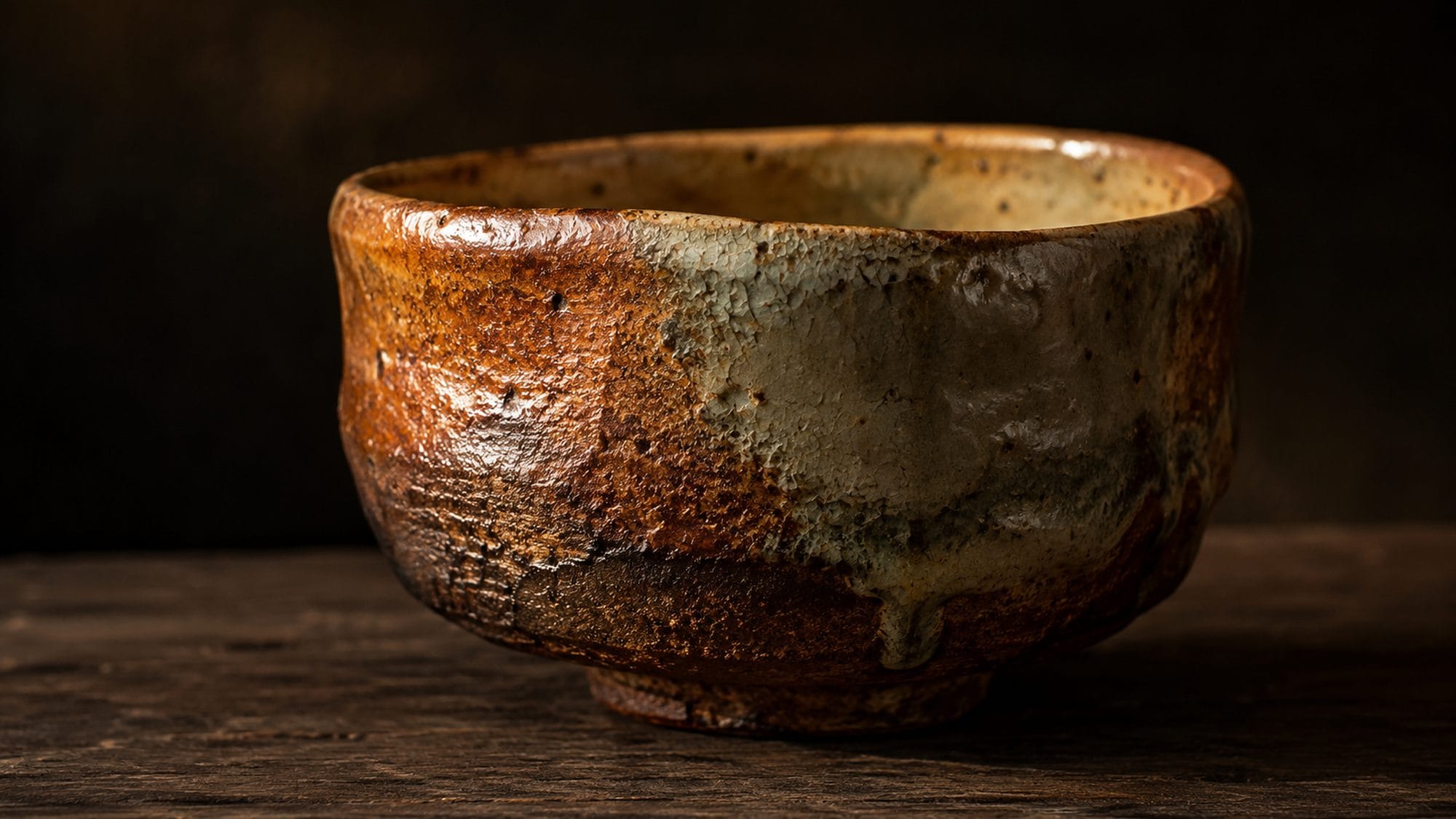
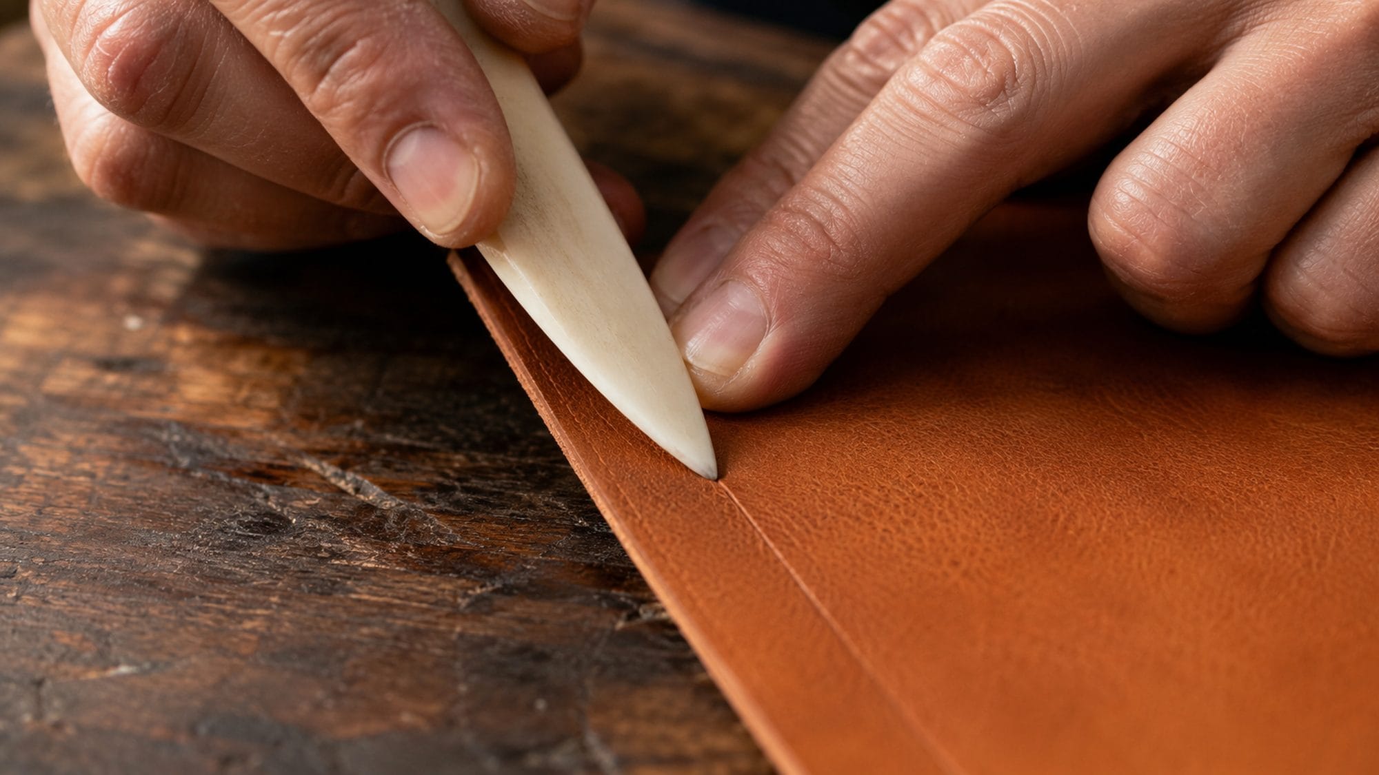
Pick up a well-made Japanese kitchen knife. The handle is plain wood, fitted to the blade with no decoration. The steel is forged to do one thing: cut cleanly. There's no branding on the blade, no logo on the handle, no box designed to make you feel like you bought something special. The knife cuts. That's the point. That's the beauty.
Now pick up a cheap knife. It has a logo stamped on the blade. The handle is molded plastic designed to look ergonomic. The box lists twelve features. It tries to be many things. It succeeds at none of them fully.
The difference isn't quality in the abstract. The difference is precision. The shibui knife is precisely one thing. The cheap knife is approximately several things.
Precision vs. approximation
Here's the reframe that changes how you think about price competition.
You're not competing against a lower price. You're competing against approximation.
The cheaper alternative doesn't win because it costs less. It wins because the customer can't tell the difference between precision and approximation on a screen. When both products look "good enough," the lower price breaks the tie.
The standard advice tries to fix this by adding to your product's presentation. More story. More features listed. More emotional hooks. More reasons to pay more.
Shibui teaches the opposite. Compete by subtracting. Make the product so precisely itself that the approximation becomes visible.
This is what every strong brand in the How Japan Brands framework does, whether or not the founder has heard the word shibui.
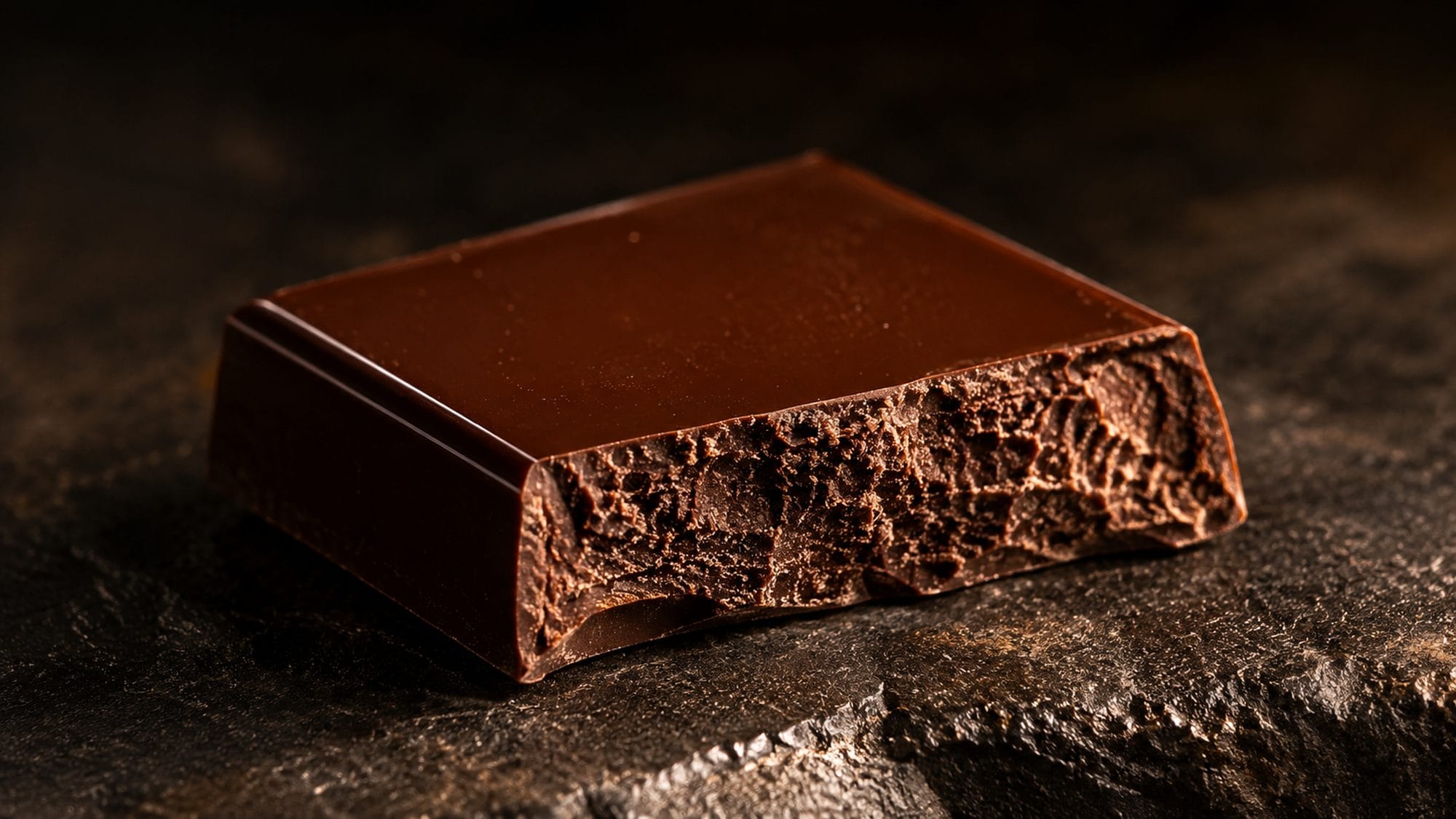
Minimal makes chocolate from two ingredients: cacao and sugar. A mass-market bar lists twenty. The subtraction reveals the ingredient. The precision makes the approximation obvious.
Hasami makes mugs with no pattern, no decoration, no ornament. Solid color. Straight sides. Flat top and bottom. Every other mug on the shelf has a pattern, a gradient, a cute design. Hasami's restraint makes the clutter visible. The mug's precision creates the contrast.
Snow Peak charges ¥60,000 for a tent and never discounts. The cheaper alternative runs sales, bundles accessories, offers "limited-time" deals. Snow Peak's price stability is a precision decision. It says: the value is exactly what we stated. We're not approximating.
Foufou sells clothes at full price, always. No seasonal markdowns, no clearance sales, no outlet channels. The price is what the fabric and the seamstress cost, with nothing added for trend-chasing, nothing subtracted at end of season. The customer never has to wonder whether they overpaid. That certainty is precision.
In each case, the brand doesn't compete by adding more to justify the price. It competes by removing everything that isn't precisely the point.
What shibui looks like in practice
Shibui isn't a style. It's a standard of decision-making. Here's what it looks like applied to the four areas where DTC founders most often fight the price war.
Product

A shibui product does fewer things, better. It doesn't have twelve features listed on the box. It has one thing it does so well that the customer remembers it.
The test: can you describe what your product does in five words? Not what it is. What it does. Minimal's answer: "Reveals what cacao actually tastes like." Tsuchiya Kaban's answer: "Carries your things for life." If your five words sound like they could apply to a competitor's product too, the product isn't precise enough.
Strip one feature this quarter. The one that's there because a competitor has it, not because your customer needs it. Watch what happens to how clearly the remaining features communicate.
Packaging
A shibui package doesn't try to make you feel like you bought something premium. It protects the product and gets out of the way.
Excess packaging is approximation. It approximates luxury through volume. Foam inserts, tissue paper, ribbon, a card with a quote, a branded sticker, all of it says: we're not sure the product alone will justify the price, so here's more stuff.
The shibui alternative: a package that fits the product exactly. No wasted space. No filler. No performance. Open the box and the product is right there, precisely presented, precisely protected, nothing else.
Website

The cheapest way to spot a brand approximating is on its website. Multiple value propositions above the fold. Stock-phrase testimonials. A carousel of five hero images because the team couldn't agree on one. Feature comparisons with competitors they don't name. Every addition dilutes the precision.
A shibui website says one thing clearly. It trusts the visitor to understand it. It uses space the way Hasami uses a blank ceramic surface, as a signal that what's there is enough.
Run the 10-second test from the How Japan Brands framework. Open your site in a private browser. In ten seconds, can a stranger answer: what does this brand sell, why should I care, and what should I do next? If any answer is unclear, the site has approximation problems, not price problems.
Communication
Shibui communication doesn't explain. It demonstrates.
Most premium brands, when faced with cheaper alternatives, start explaining why they're worth more. They list the materials. They describe the process. They tell the origin story. All of it is justification, and justification is the sound of a brand on defense.
The shibui approach: show the thing. Let the customer see the grain of the wood, the thickness of the ceramic wall, the drape of the fabric. Don't explain why it's better. Make the precision visible. The customer draws the comparison themselves.
This is harder than explaining. It requires confidence that the product's quality is visible without narration. If it isn't, the problem isn't messaging. The problem is the product.
The Precision Audit

Here's a practical tool for applying shibui to your brand.
Make a list of every element in your brand that faces the customer: product features, packaging components, website sections, social posts, email sequences, ad copy, everything.
For each element, ask one question: Does this make the product more precisely what it's meant to be, or does it add complexity that dilutes the core?
Mark each element P (precision) or A (approximation).
The P elements are your competitive territory. Protect them. Don't change them. They're the reason your customer chooses you over the cheaper option.
The A elements are where the cheaper alternative has you playing their game. Every time you add a feature because a competitor has it, list a benefit because the category expects it, or explain your price because someone asked, you're approximating. You're moving away from precision and toward the same undifferentiated middle where price is the only tiebreaker.
Cut one A element this week. Not eventually. This week. Watch whether the remaining elements communicate more clearly without it.
Your move
Put your product and the cheaper alternative side by side. Not on a comparison chart. Physically, if you can. On a screen, if you can't.
Look at both. Don't read the descriptions. Don't check the reviews. Just look.
What makes your product look precisely itself? What makes the cheaper one look like it's trying to be several things? If you can see the difference, your customer can too, but only if you stop burying the precision under approximation.
This week, remove one thing from your product page, your packaging, or your homepage that exists to justify your price rather than to demonstrate your product. One explanation. One feature badge. One comparison chart. One stock-phrase testimonial.
What remains should be clearer than what you had before. Precision sharpens when approximation is removed.
You don't compete against a lower price by adding more reasons to pay more. You compete by being so precisely yourself that the cheaper alternative looks like what it is: an approximation of something it can't quite be.
That's shibui. The beauty of something that doesn't need to explain itself.
Sources and further reading
-
Japanese Aesthetic Sense: Shibui
KOGEI Standard — editorial — an explanation of shibui from a Japanese crafts publication, placing the concept within the broader tradition of restrained beauty. -
Shibui: The Japanese Art of Finding Beauty in Aging
ASA Generations, Sanae Ishida, April 22, 2026 — book excerpt — covers Yanagi Soetsu's seven elements of shibusa (simplicity, implicitness, naturalness, modesty, everydayness, imperfection, silence) and the concept's etymology. -
The Unknown Craftsman: A Japanese Insight into Beauty
Yanagi Soetsu, translated by Bernard Leach, 1972 — book (Kodansha International) — the foundational text on shibui and mingei aesthetics, defining beauty as that which emerges without the intent to be beautiful. -
A Tractate on Japanese Aesthetics
Donald Richie, 2007 — book (Stone Bridge Press) — places shibui within the broader context of Japanese aesthetic categories including wabi-sabi, mono no aware, and miyabi. -
The Pursuit of Comparative Aesthetics: An Interface Between East and West
Hussain, M. & Wilkinson, R., 2006 — book (Ashgate Publishing) — academic treatment of shibui and cross-cultural aesthetic comparison between Eastern and Western traditions.