
How I'd rebrand a heritage Japanese sumi ink maker for a global audience
A full brand playbook for taking a heritage Japanese sumi ink maker from regional craft producer to global DTC brand.
Hypothetical situation: A heritage sumi ink maker contacts me. They've been pressing handmade ink sticks in Nara, a prefecture in western Japan, since the late 1500s. The current owner is the eleventh-generation master.
They supply professional calligraphers, ink painters working in the sumi-e tradition (the Japanese practice of monochrome ink painting), and a handful of museums across Japan. Outside Japan, no one knows they exist.
Their website is in Japanese only. No English social media. The thin English-language commercial layer has been outsourced to a third-party distributor who runs a separate WordPress template and sells through a Shopify storefront on a different domain. The quality of their ink is world-class. Their brand, to the English-speaking world, doesn't exist.
The ask: build a brand that can sell directly to calligraphers, designers, illustrators, and craft buyers worldwide, in English, without losing what makes the ink worth buying in the first place.
This is what I'd do.
The starting point
The maker is in Nara, the historic center of Japanese ink-making since at least the seventh century. Sumi made at Kofukuji Temple, one of Nara's major Buddhist temples, is regarded as the origin of Nara ink. While sumi was produced across Japan during the Heian period (roughly 794 to 1185), production gradually concentrated in Nara. By the mid-Edo period (the 1700s), around forty sumi shops were operating in the city. Today, roughly ninety percent of the sumi produced nationwide is still made in Nara.
In 2018, Japan's Ministry of Economy, Trade, and Industry certified Nara inkstick production as a traditional craft. It was the second sumi craft to be designated, after Suzuka inksticks from Mie prefecture.
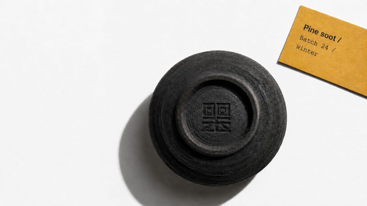
What makes traditional Nara ink different from industrial alternatives is the soot. Most modern ink uses industrially-produced lampblack: clean, consistent, fast. Traditional Nara ink starts from soot collected by hand. Vegetable oils or pine resin are burned over open candle flames, week after week, with the soot settling on dish surfaces above. The collection is slow. The yield is small. The particles are finer than any industrial process can match.
This is the gap. Not a product gap. A language gap. The world's calligraphers, designers, and serious sketchers don't know the difference between hand-collected and industrial soot, because no one has explained it in English. The market trusts the quality. But the story has never been told.
Step one: positioning
Positioning comes first. Before the name, before the logo, before the website. Positioning is the answer to one question: why should someone choose this brand over every other option?
I use a tool called the "only" statement. It forces you to fill in a single sentence: "We are the only ___ that ___." If you can't complete it, your positioning isn't sharp enough. If your competitor could say the same thing, it isn't real positioning.
We landed here:
"The only Japanese sumi ink brand still made from soot collected by hand, week by week, every winter."
That sentence names the category: Japanese sumi ink, not "ink" or "Asian inks." It draws the line: hand-collected soot, not industrially-produced lampblack. And it raises the stakes: an annual production cycle bound by physical constraints, with everything that implies for scarcity and seasonality.
No other English-language sumi brand can say this. The mass-market ink-stick brands don't collect their own soot. The Western art-supply retailers who source Japanese sumi obscure the makers behind their own house labels. The positioning is real because it's exclusive to this way of working.
The customer
A clear position needs a clear customer. Not "anyone who likes calligraphy." One person.
She's a serious working artist or designer. Thirty to fifty-five years old. Studio-based, not hobbyist. Her tools matter to her output. She already owns the kind of professional gear a working studio runs on: a precision airbrush, a set of sable brushes, a flat-file of premium Japanese paper. She pays more for things that work better and survive longer.
She wants to work in sumi. She's read the Pigment Tokyo blog. She's seen the Cy Twombly retrospective and the recent Shitao show at the Met. She knows that hand-ground ink behaves differently from bottled India ink. But she doesn't know which stick to buy, where to buy it, or whether the seller is the maker.
She doesn't speak Japanese. She's seen dozens of online stores selling "premium Japanese sumi" and can't tell which ones are real. She's willing to spend a hundred to four hundred dollars on a single stick if she trusts what she's getting. She wants to feel confident she's not paying for a wholesaler's markup on a generic product.
The problem
The best Japanese sumi is locked behind a language barrier. This customer either settles for an industrial stick from a Western art-supply chain or pays a premium to a third-party reseller whose own brand says more about the reseller than about the maker.
She doesn't need a better ink to exist. She needs a way to find the good ones and trust what she's buying.
Step two: naming
The company's real name can't travel. It's Japanese, it carries a poetic four-character meaning that won't survive translation, and the romanization is hard for English speakers to pronounce on first read. The rebrand needs a new name.
The name I chose is Sumi.
In Japanese, 墨 (sumi) is the word for the ink itself. The substance, in its solidified stick form. The same character, read mò in Mandarin, is shared across the East Asian calligraphic tradition. The word also appears in sumi-e (墨絵), the ink-painting style already familiar to Western art audiences through the work of Hiroshi Yoshida, Toko Shinoda, and the postwar gestural abstractionists who carried it forward.
Across every major language I checked, the word has no negative meaning. In English, it's increasingly recognized as a category term, not a brand. Naming the brand after the substance only works when the substance has cultural prestige and commercial obscurity in equal measure. That's the situation here.
I also checked two other candidates I considered. One had a homophone in Japanese for "corner" that risked being read as a place name in cataloging systems. The other was a poetic kanji meaning "to congeal" with a reading that overlaps with a slang term in Korean. I disqualified both.
Name audits across languages aren't optional. They're a requirement.
Sumi. The hypothetical domain is sumiink.com. The hypothetical social handle is @sumiinkofficial across all platforms. One syllable in Japanese, two in English, and a meaning that maps directly to the craft.

Step three: identity
Identity is the visible layer. It's what the brand looks like, sounds like, and feels like in the customer's hands. Every identity decision flows from positioning. If the positioning says "soot collected by hand, week by week, every winter," then the identity has to feel patient, material, and deliberate.
What it must not look like
Every English-language sumi seller operates inside the same visual vocabulary. Bamboo silhouettes. Calligraphic brushstrokes used as page decoration. Red corner-seals applied to everything regardless of context. The "Asian aesthetic" trap.
That aesthetic signals "souvenir shop" or "ESL textbook cover." It talks to tourists and beginners, not to a working artist choosing the stick she'll use on her next commissioned piece.
Sumi the brand doesn't compete with other sumi sellers. It competes with the broader world of luxury craft brands where the product is a physical object rooted in a single material discipline, and where restraint is the signal — the product's quality and the package's economy do the work that decoration would do for a weaker brand.
The kanji mark
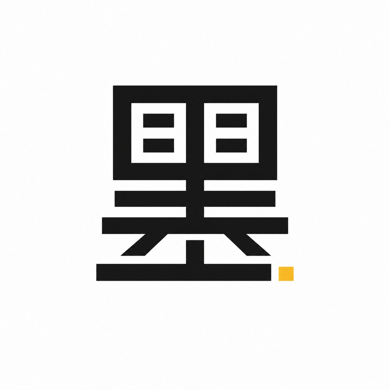
The brand uses a stencil-precise rendering of 墨 as its standalone icon. Geometric, rectilinear, almost industrial — closer to a stamped catalog symbol than a calligraphic brushstroke. This works as a favicon, a social media profile image, a label-band stamp, and a pressed mark on every product surface.
The precedent isn't Japanese calligraphy. The precedent is professional-tool branding — the way precision tool brands commit to a single engineered mark and stamp it on every product without decoration. Western consumers read the kanji as a confident graphic. Japanese-literate customers read the literal meaning. The mark works on both levels without explaining itself, and it carries the brand's tool-discipline at a glance.
Color palette
Four colors. Engineered, not poetic.
Sumi Black (#0A0A0A): the brand color. Saturated, near-pure black. Used at large surface area — packaging body, labels, the kanji mark. The color of the ink itself.
Paper White (#FAFAFA): flat plain backgrounds for every product shot, every catalog spread, every web surface. Modern and neutral. Not cream, not warm-tinted washi. The brand reads as professional-tool, not heritage gift.
Saffron (#D9A441): the unexpected accent. Pulled from the natural fragrance traditionally added to high-grade sumi ink. Used sparingly: one underline beneath the wordmark, one square mark on the kanji, one label band per product line. Single-pop accent, never decoration.
Indigo (#1E2640): secondary accent for catalog category dividers and label-band variants. Used even more sparingly than the saffron.
No red. No gold. No black-and-red scheme that signals "Asian-themed product." No warm-cream washi background that signals heritage gift shop. The palette is built like a tool brand's palette — disciplined, system-led, with one unexpected color (the saffron) that becomes the brand's recognition asset.
Typography
A modern sans-serif for the wordmark and headlines — confident, geometric, tightly spaced, with even stroke weight and minimal letterform decoration. Specific faces in this register: Söhne, Neue Haas Grotesk, or GT Walsheim. The wordmark reads as a precision tool catalog, not as a heritage publishing house.
A clean sans-serif for body copy that steps back and lets the content lead. Inter or the lighter weights of the headline face.
A precise monospaced face for catalog data — every label band, every spec callout, every product index. Söhne Mono or GT America Mono. The monospace lends scientific-catalog credibility and ties every product to the same data system.
For Japanese text in body copy and product labels, Noto Sans JP at light weight. Sans, not serif. Present but not decorative.
Hard ban on warm or romantic serifs (Garamond, Freight Display, Cormorant). Those signal luxury fashion or heritage gift, not professional tool. The wrong font choice would undo every other identity decision.
Photography direction
Studio product photography. Hard directional light from the upper-left or upper-right, sharp clean shadows that ground each object. Flat plain Paper White backgrounds across every shot. Saturated colors and true blacks. Modern digital sharpness, no film grain, no warm-film color shift, no soft window light, no faded highlights.
Tight catalog-product crops with engineered negative space for typographic overlay. Every image looks like it was shot for the same product catalog by the same photographer in the same studio session. Consistency is the visual signal of brand discipline.
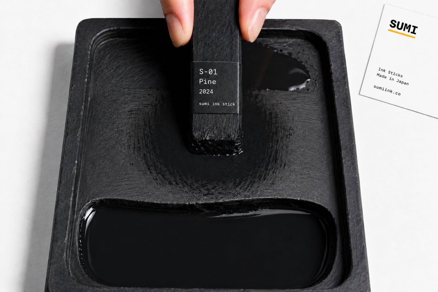
Process and studio shots follow the same studio rules: the soot specimen, the mid-grind on a suzuri (a Japanese ink-grinding stone), the worktable overhead. They are still product photography — the soot is the product, the suzuri is the tool. Not soft-mood editorial. Not a film-grade workshop documentary.
Packaging
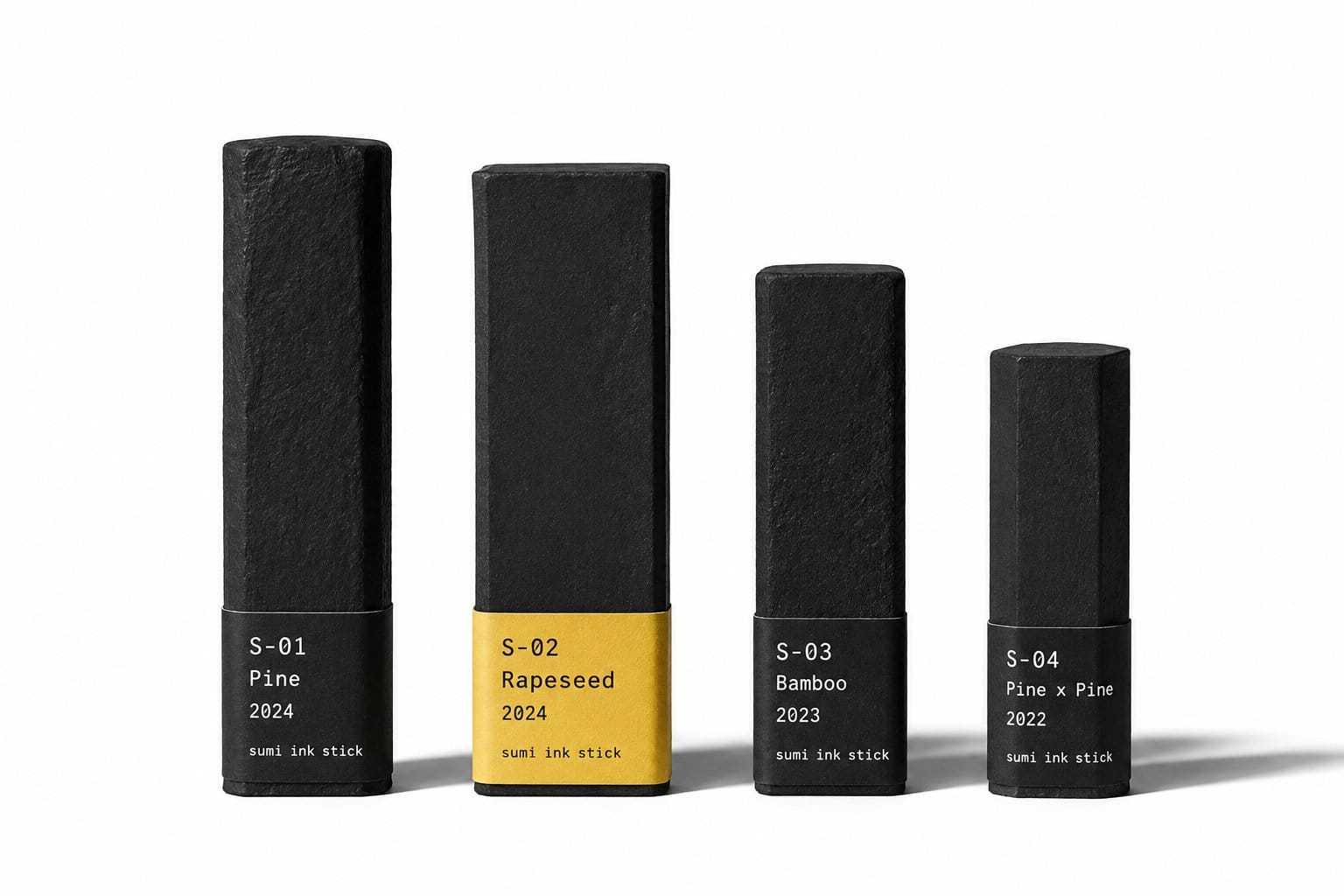
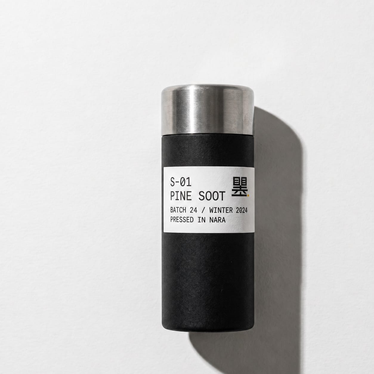
The ink stick ships in a matte black cylindrical tube — recycled aluminium body, brushed stainless-steel screw cap, and a wraparound letterpress label band printed in monospace. The label carries the catalog data and nothing else: catalog number, soot type, batch and season, the place pressed, and the small saffron 墨 mark. No promotional inserts. No discount code. No founder letter. The data on the label is the founder's letter.
The packaging carries the same register as the product itself: clinical, restrained, engineered. A matte cylindrical body. A brushed-metal cap that screws on with a precise stop. A typographic data label running around the tube, printed in monospace. No ornament, no flourish, no founder signature, no gift-shop softness. The buyer is paying for performance and longevity, and the packaging signals both. The aluminium tube is recyclable. The cap is reusable for sealed storage between grinding sessions. Everything earns its place.
This is where tsutsumi (the Japanese concept of wrapping as an expression of care) earns its place — not as a gift-shop flourish, but as a working tool whose packaging respects the buyer's studio.
Step four: storytelling
Positioning tells you where the brand stands. Identity gives it a face. Storytelling is what it says and how it says it.
I structured the storytelling layer using the Golden Circle, the framework Simon Sinek developed. The idea is simple: most brands communicate from the outside in. They start with what they sell, then explain how they make it, and hope the customer figures out why it matters.
The brands that build real loyalty do the opposite. They start with why.
Why
The world's most considered ink should be available to the world's most considered makers.
How
A single workshop in Nara. Soot collected by hand over open candle flames every winter. Animal-bone glue, no synthetic substitutes. Wooden molds that have been in continuous use for generations. Drying for months in straw and ash before the stick is ready to ship.
What
Handmade Japanese sumi ink sticks. Limited annual production. Shipped worldwide in matte black recyclable-aluminium tubes, every label printed with catalog number, soot type, batch, season, and the master who pressed it.
The "why" carries the weight. A customer who only hears the "what" sees another art-supply listing. A customer who hears the "why" first sees a brand with a point of view.
She buys because she agrees with the belief. The ink is secondary.
The brand narrative
The story reads like this on the site. It's written for someone who may not speak English as a first language and may have only seen sumi-e in a museum:
The best calligraphic ink in Japan isn't made in factories. It's made in Nara, the small city east of Kyoto where ink-making began in the seventh century, when monks at Kofukuji Temple first ground charcoal with deer-bone glue.
Today, most sumi is industrial. Cheap, consistent, fast. The soot is produced by machine and shipped in by the kilogram.
One workshop in Nara still does it the original way. Vegetable oils burned over open candle flames every winter. The soot caught by hand on dish plates set above the flame. Mixed with hot animal-bone glue. Pressed into wooden molds. Dried for months in straw and ash.
The result is a stick that, ground on stone with clean water, releases an ink with finer particles, a slower drying time, and a tonal range no industrial soot can produce. Calligraphers can feel the difference in the line. Painters can see it in the wash.
Sumi exists to bring this ink to the working artists, designers, and illustrators who would use it if they could find it. The sticks are limited. The shipping is global. The story belongs to the master who pressed each one.
Short sentences. No jargon. No word that would stop a non-native reader mid-sentence. The meaning is clear on the first pass.
The master
You can't build a brand around the idea that "the master deserves to be known" and then leave the master anonymous. Here is the profile that runs on the site:
Matsumoto Hideo — eleventh-generation master. Started in the workshop at age fifteen, alongside his father. Took over the press in 1998. Burns rapeseed and pine-resin oils for soot from October to April every year. Outside the production season, he travels to forests in Wakayama and Kumamoto, two Japanese prefectures known for old-growth timber, to source the resin himself. Refuses to switch to a synthetic binder, even though it would let him produce year-round. "The animal glue holds the soot in a way the synthetic can't reach," he says. "If I can't tell the difference in the line, I'll switch. I haven't yet."
The profile is short and specific. No grand claims. No "living national treasure" language. Just what he does, how long he's done it, and one detail that makes him real.
Brand voice
Sumi speaks in short, plain sentences. Warm but not chatty. Specific but not technical. The voice assumes the reader is smart but may not speak English as a first language.
A sample product description:
S-03 Pine-soot stick. Aged three years. Pressed by Matsumoto Hideo, winter 2023.
A traditional shōen-boku ink, made from soot collected over pine-resin flames. The resin produces a soot with larger particles than the rapeseed-oil version. The line is darker, denser, with a faint blue undertone in the wettest passages.
Suited to bold calligraphic strokes and broad sumi-e washes. Less suited to fine line work, where the S-02 rapeseed soot performs better.
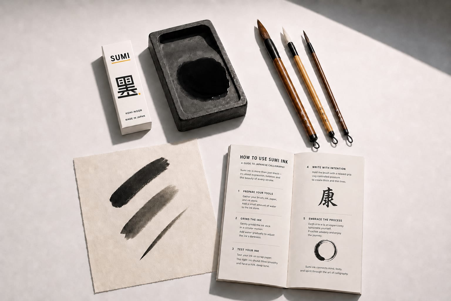
Grind on a suzuri stone with one tablespoon of clear water. Ten minutes for a working ink. Twenty for a deep, gel-like ink that holds a flat plane on the brush.
This stick will keep, sealed in its tube, for decades. The longer it ages, the more the soot and glue settle into one another. Some collectors prize sticks that have been kept thirty years or more.
Ships in a recyclable-aluminium tube with the catalog number, soot type, batch, season, and master named on the label.
No superlatives. No "exquisite." No "unparalleled." The facts do the selling. The names do the trust-building.
Content pillars
Three topics. Each one maps to a layer of the brand.
The master. Profiles of Matsumoto and the seasonal calendar he keeps. What the workshop looks like at four in the morning during a soot-collection week. What oils he prefers and why. How he tests a finished stick before shipping. This is content no other English-language sumi brand can produce, because they don't have the access.
The material. Specific writing about soot types, glue grades, paper pairings, and stones. Not encyclopedic. Each piece tells you why a material choice matters to your work. "Pine-resin soot has bigger particles than rapeseed-oil soot. The line is darker. If you're working in heavy strokes against a wet wash, this is the soot that holds its weight."
The practice. How to grind, how to dilute, how to store, how to read a finished line for clues about your technique. The idea of working with the same stick for a decade, watching it age, watching your own hand age with it. This is where the brand's deeper belief extends to the customer's own studio practice.
The touchpoint chain
Every moment from discovery through ownership, designed to lead with why.
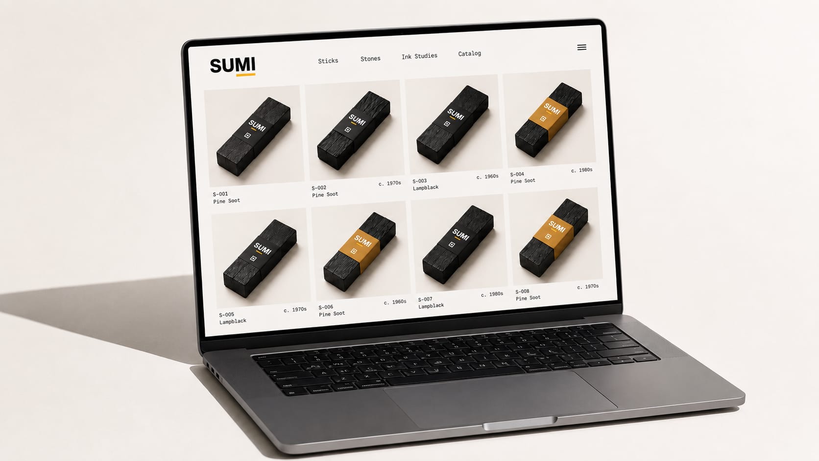
Discovery (Instagram, editorial features, word of mouth in working-artist circles). The feed isn't product-shot after product-shot. It alternates: a soot specimen on flat white, a hand grinding a labeled stick on a suzuri, the catalog lineup of four sticks, a brush test mark on cream paper, the brand's stencil 墨 mark on a label band, the open spec booklet. Every image looks like it was shot in the same studio session. No text overlays. No prices in captions.
Consideration (the website). The customer arrives and meets the brand story before the product catalog. She reads about the seasonal soot collection, the eleven generations, the refusal to switch binders. She understands why these sticks cost what they cost before she sees a price tag.
Purchase (checkout). Clean and minimal. No pop-ups. No countdown timers. No discount codes floating in from the corner. A note at checkout: "Each stick is pressed to order during the winter production season. If you order between October and April, expect shipping within four weeks. If you order outside the season, expect shipping after the next October." The wait is a feature. The stick doesn't exist yet because Matsumoto hasn't finished pressing it.
Unboxing. The matte black aluminium tube. The brushed-steel cap. The wraparound monospace label band carrying the catalog number, soot type, batch, season, and master. The small saffron 墨 mark stamped beside it. No promotional inserts. No "review us on Google" card. The data on the label is the only message.
Ownership. The care guide is itself a piece of storytelling, written in the brand voice. It covers grinding technique, water ratios, storage, and the idea of patina as a record of use. A follow-up email two months later doesn't ask for a review. It shares a short essay on how sumi ink ages in the wrap.
Advocacy. When another artist asks "where did you get that stick?" the owner can answer with a name. Not "some Japanese supplier" but "a master named Matsumoto in Nara pressed it in winter 2023." The label band makes this transfer of story easy. It gives the customer a catalog-precise fact worth sharing: a single craftsman, in a single town, pressed this batch in a season I can name.
What this demonstrates
The sequence matters. Positioning first. Then identity. Then storytelling. Each layer depends on the one before it.
Skip positioning and the identity is decoration. It looks nice, but doesn't mean anything. Skip identity and the storytelling has no visual language to live in.
Start with storytelling and you end up sounding like everyone else. That's what most brands do, posting on Instagram before they've figured out what they stand for.
The system works the same way whether the brand is a centuries-old ink maker or a startup selling supplements. Define where you stand. Give that position a face. Then tell the story.
The ink was always good. It just needed a voice.
Sources and further reading
Sources cover the product category and regional craft tradition. No brand-specific sources are linked — see the note at the top of this article.
-
Nara Ink (Nara sumi)
KOGEI JAPAN, Japan Traditional Crafts Aoyama Square — traditional-craft category page — Source for the Kofukuji Temple origin, the Heian-period production history, the mid-Edo concentration to roughly forty Nara shops, and the 90% national share Nara still produces. -
How sumi ink sticks are made in Japan
Beyond Calligraphy — process explainer — Source for the soot collection over open flame, the animal-bone glue (nikawa), the seasonal production cycle, and the wooden-mold pressing technique. -
Vintage Sumi Ink: Exploring the Beauty of Kogaboku
Pigment Tokyo — editorial — Source for the aging behavior of high-grade sumi, the collector market for vintage sticks, and the difference between pine-soot and oil-soot sticks. -
Tsu Tsu Mu: Japanese Wrapping as Caring
Wallpaper magazine — design editorial — Source for the tsutsumi concept underlying the packaging design. -
The Golden Circle
Simon Sinek Inc. — framework page — Source for the why-how-what storytelling structure used in the brand narrative section. -
Heritage by Hand: Japan's Traditional Craft Program
JAPAN HOUSE Los Angeles — cultural-program editorial — Source for the broader context of Japan's Ministry of Economy, Trade and Industry traditional-craft designation system.